Creating stunning visuals to tell stories is a blast, especially as data keeps pouring in from every corner of our world. Interactive data visualization open-source tools offer the elixir for your storytelling, making it simple to transform raw data into compelling visuals without breaking the bank. Whether you’re a data geek or just someone who wants to jazz up a presentation, open-source tools are your best buddies. Let’s dive into some of these powerhouse tools, with their vibrant communities and extensive customization options, offering both novices and data aficionados what they need to create magic on screens.
Harnessing the Power of Interactive Tools
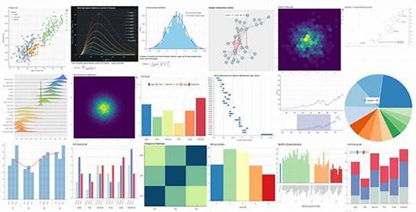
When it comes to interactive data visualization open-source tools, they are like the Avengers of data. These tools help you unleash the power of your data and make it dance on your screen. Tools like D3.js, Plotly, and Bokeh serve as your palette, allowing you to paint colorful and interactive visuals that grab attention. With interactivity at the core, users can dive deep into the data, drill down to specifics, and have a hands-on experience that static graphs just can’t provide. The open-source nature means you have a massive community backing you up. Whether you’re stuck on a glitch or need inspiration, there’s a fellow coder or a super-user out there with a fix or an enticing idea. Plus, the customization is wild! You can tweak your visuals to the nines and style them to match your brand or your wildest dreams. By jumping onto these interactive data visualization open-source tools, you’re not just displaying data; you’re weaving a story, making data excitement contagious, and most importantly, accessible.
Top Tools in the Game
1. D3.js: The OG of interactive data visualization open-source tools, offering complete control over visuals. It’s like having a blank canvas to create a masterpiece.
2. Plotly: This tool vibes with Python, R, and JavaScript users. It’s the go-to for making sexy graphs fast.
3. Bokeh: Ideal for Python peeps who want to keep things spicy. It’s like your own magic wand to animate data.
4. Chart.js: Perfect for beginners. With jaw-dropping simplicity, you’ll have interactive charts popping up in no time.
5. Leaflet: If you’re plotting maps, this one’s for you. It’s lightweight and ready to rock your geo-data world.
Why Choose Open Source Tools?
Interactive data visualization open-source tools are a solid bet if you’re down for flexibility and community spirit. You don’t get locked in some proprietary mess. Nah, you’re free as a bird to tweak and adjust your visuals. With mountains of community support and tons of plugins, these interactive data visualization open-source tools let you innovate without bounding limits. Quality support from forums and user communities is a major win. They’re like having a full team of experts without hiring a single soul. So, for anyone who’s stepping into the visualization game, open-source is where it’s at—inviting, resource-rich, and ready to help you bring your data dreams to life. Not only are you creating stunning visuals, but you’re also learning and growing with each project, soaking up the vibes from enthusiasts and professionals who’ve been there and done that.
Exploring the Features
1. Customization Galore: Tweak your visuals to fit your project like a glove.
2. Community Support: Access a thriving community with answers and shared knowledge.
3. Free to Use: No licensing fees make these tools killer for budget-conscious creators.
4. Rich Libraries: Add endless plugins and extensions for enhanced functionality.
5. Cross-Platform Compatibility: No matter your setup, these tools got you covered.
6. Scalability: Handle small projects or huge datasets without breaking a sweat.
7. Interactivity Options: Engage audiences with features like zooming and panning.
8. Frequent Updates: Benefit from continuous improvements and bug fixes.
9. Easy Integration: Seamlessly works with other tech, making it versatile AF.
10. Educational Resources: Tons of tutorials and documentation to get you rolling.
Community and Learning
Getting your hands on interactive data visualization open-source tools is like joining an epic squad. You have this whole community cheering you on, guiding you through bumps in the road. Whether you’re on the hunt for tutorials, forums, or collaborations, there’s a wealth of knowledge waiting. It’s like an adventure database enthusiasts don’t want you to miss. Each project you undertake is a chance to learn something new, delve deeper into tips and tricks, and improve your skill set. It’s a two-way street; you gain insights and have a chance to contribute, adding your voice to the evolving story of open-source dynamics.
The Future of Data Visualization
As we continue to collect more data than ever before, the pressure’s on to make sense of those numbers. Interactive data visualization open-source tools aren’t just the now, they’re the future. Expect these tools to only get sharper, integrating AI, real-time data feeds, and augmented reality for even richer experiences. We live in an era where data dictates decisions, and having the skills to turn numbers into narratives is a game-changer. By embracing interactive data visualization open-source tools today, you’re not just riding the current wave; you’re gearing up for the future—prepared, skilled, and ready to dazzle with data-driven stories that speak volumes and spark enlightenment.